Nadiuhki
As a freelancer or in-house, the goal stays the same:
connection and communication with impact, always with a little
cultural background and a humor spice!
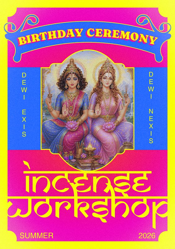
Incense Workshop
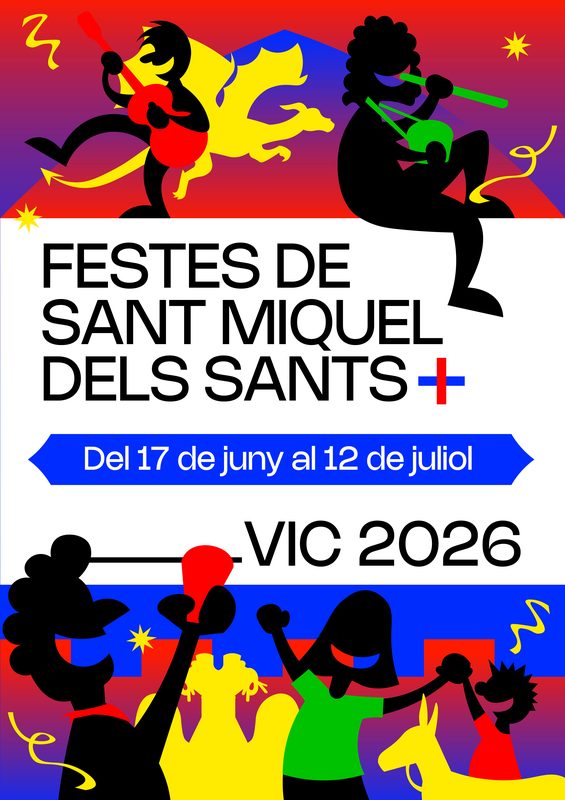
Festes de Vic
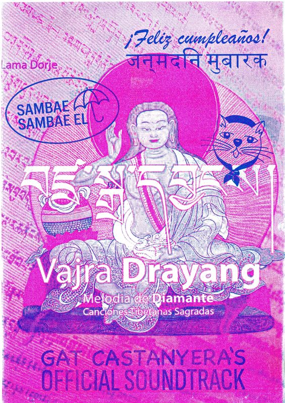
Sambae Sambae
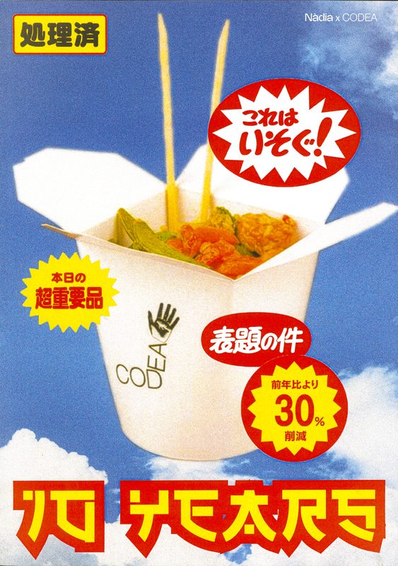
CODEA
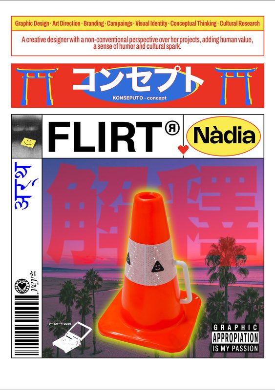
Flirt
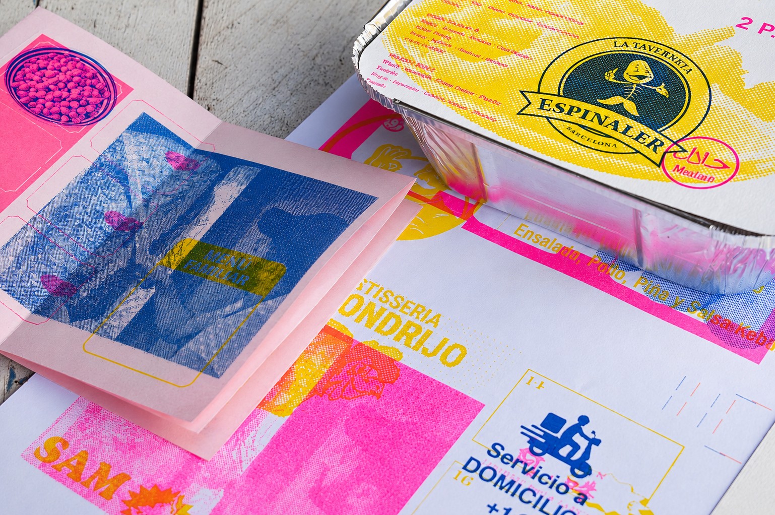
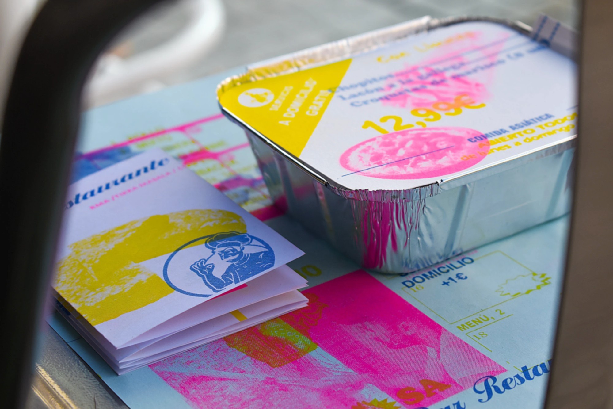
Fast-food graphic details are Barcelona's overlooked visual language.
Chaotic typographies, clashing colour combinations, hand-drawn logos.
Each street-food stall develops its own aesthetic code, often unconsciously.
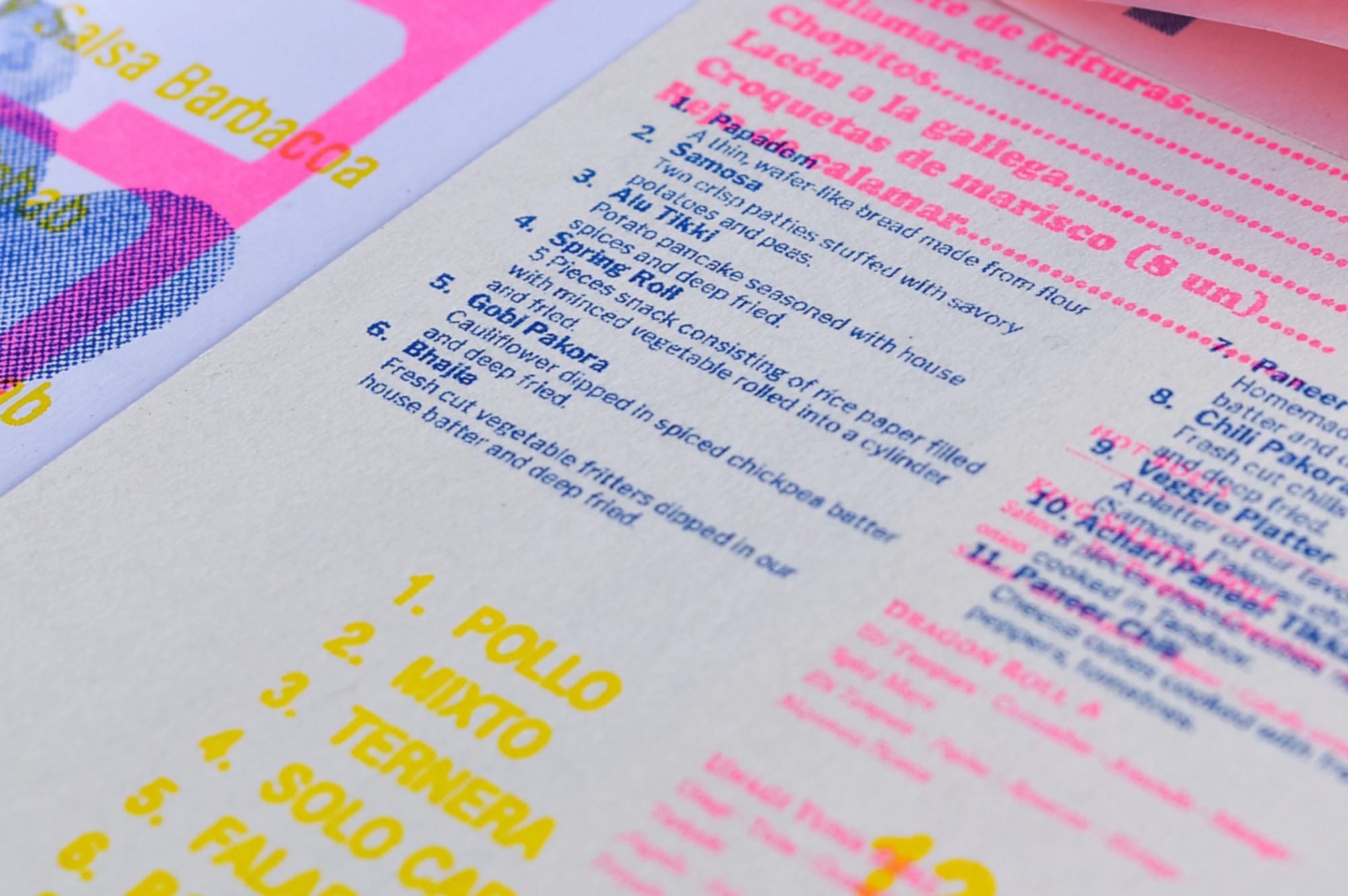
Bar Masala investigates these unspoken patterns, extracting visual identity from spaces designed by necessity rather than strategy.
Through risography, the project captures and reinterprets these identities in printed trays and fanzines.
Masala means blend in Hindi, reflecting the collision of graphic styles found on storefronts.
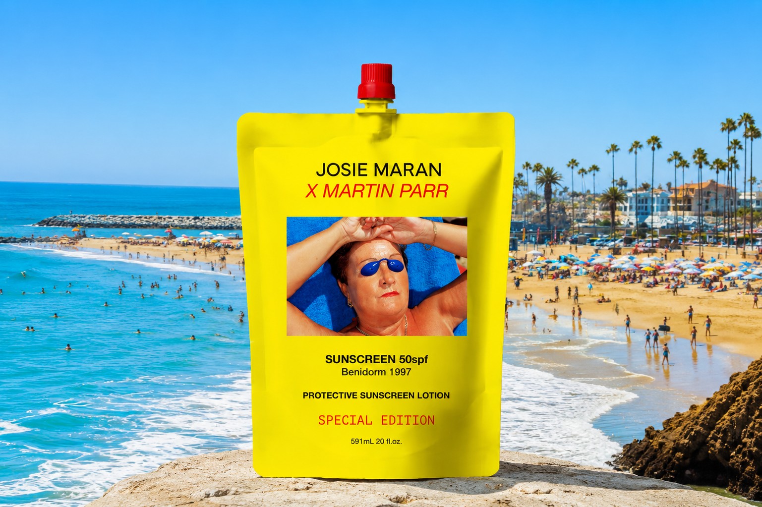
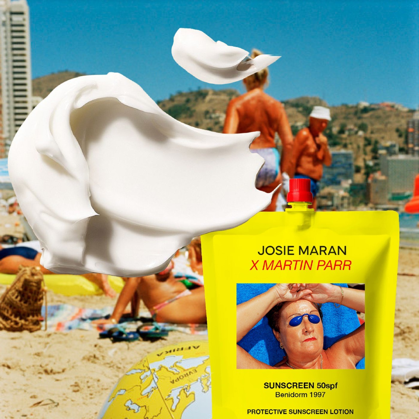
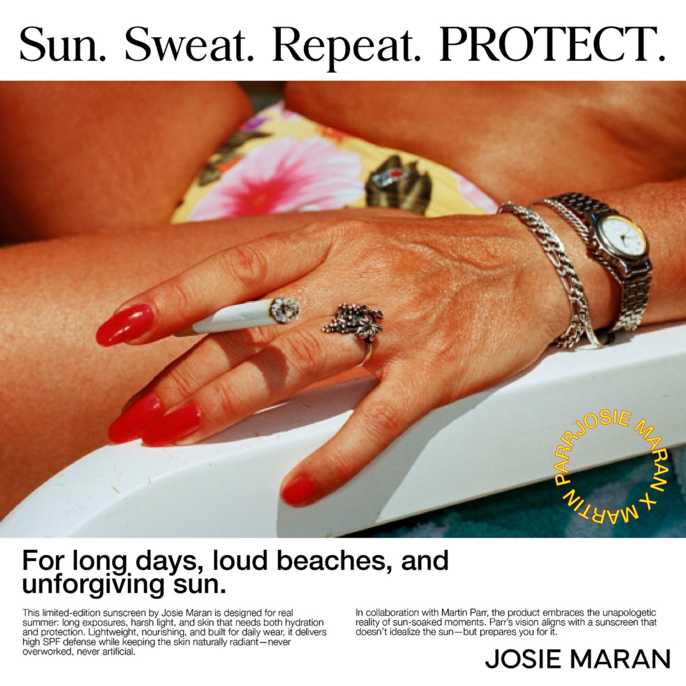
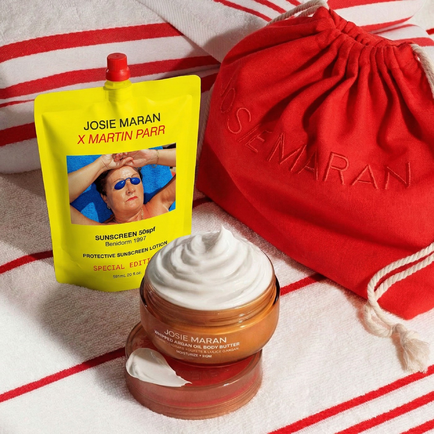
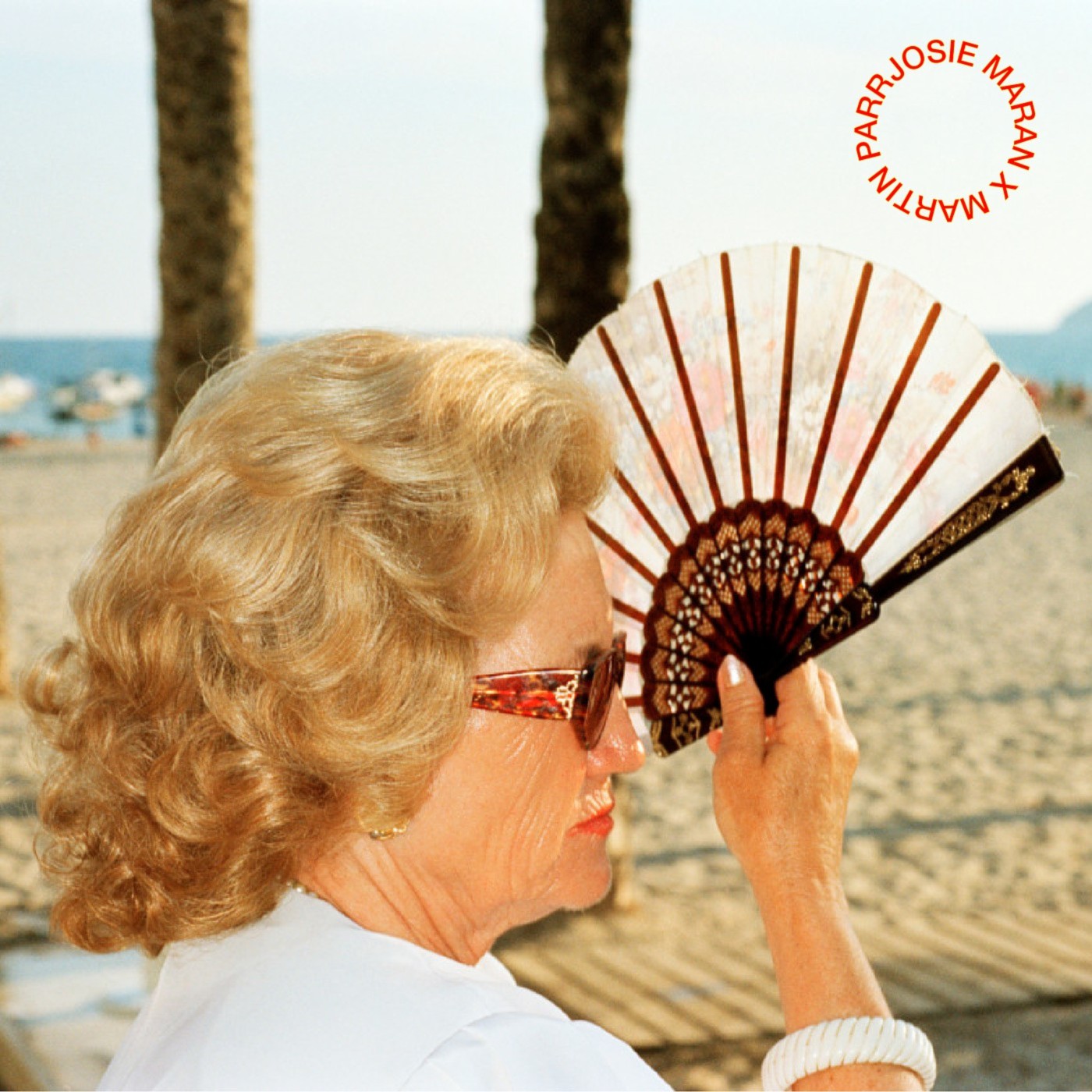
Beauty brands and documentary photographers rarely intersect.
Josie Maran celebrates skin protection.
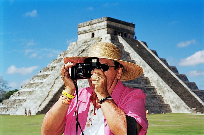
Martin Parr documents the absurdity of leisure culture.
Yet this limited-edition sunscreen packaging proves contradiction creates conversation.
Through Benidorm's vintage aesthetic and Parr's ironic eye, two opposing visions coexist.
It's a statement for those who value care, beaches, and the poetry in ordinary holiday moments.
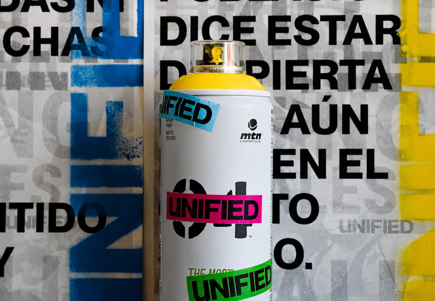
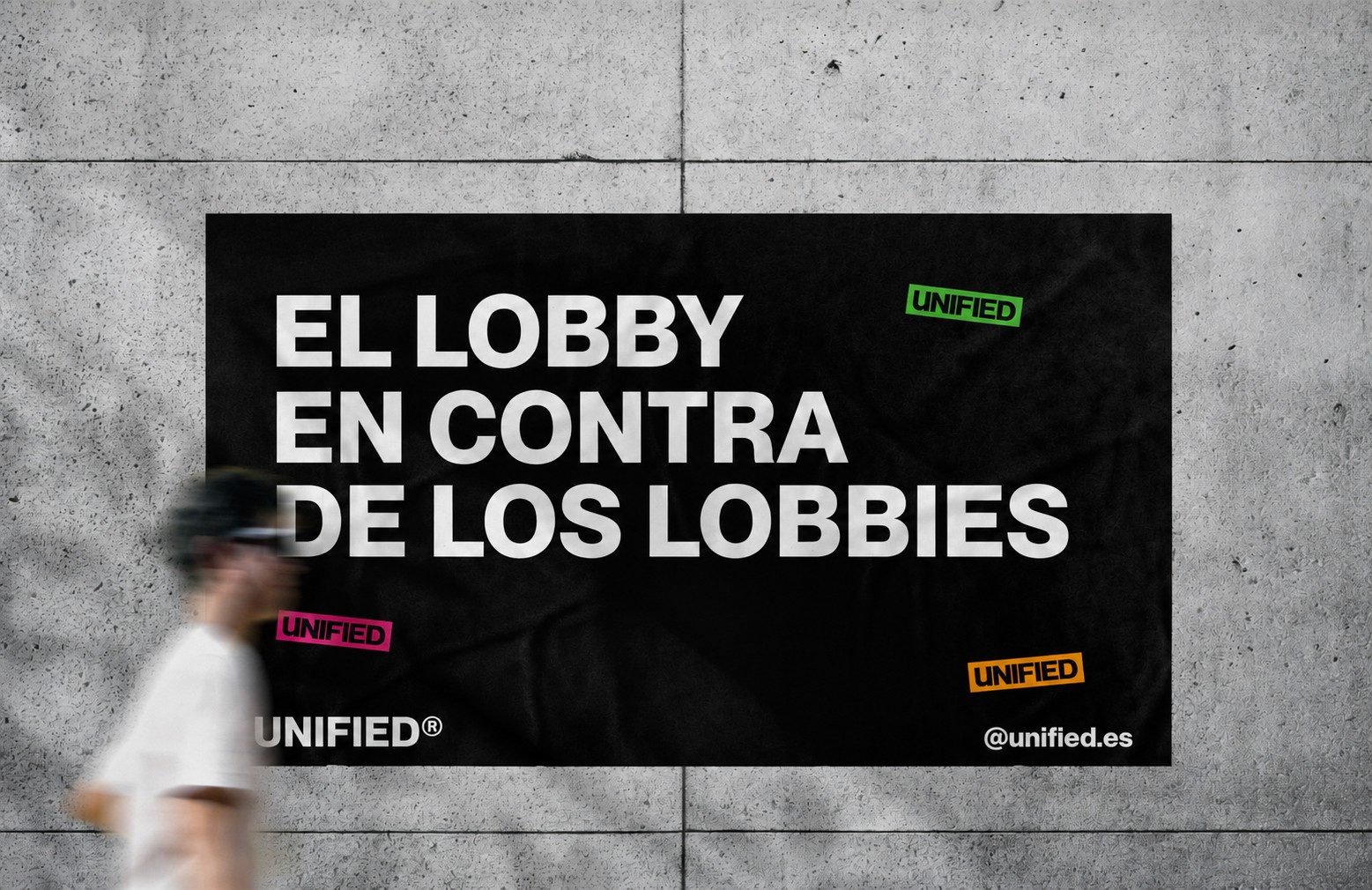
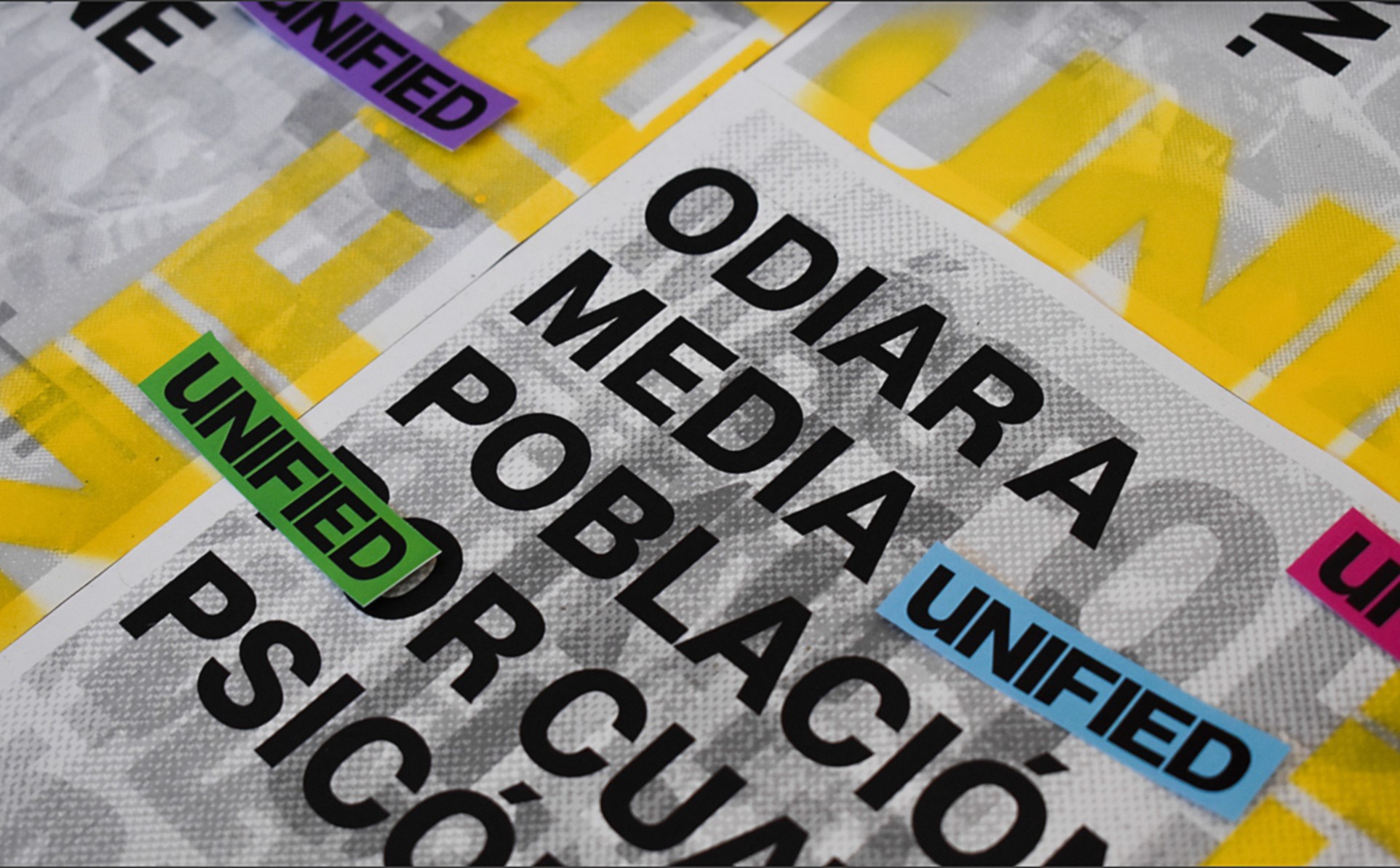
What if advertising became resistance? UNIFIED emerged from frustration with systemic decline and the lobbies that fuel it.
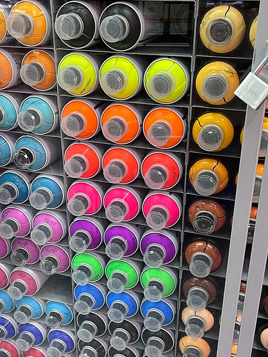
We designed a street campaign: stencils, spray paint, stickers, that use the tools of power against itself.
The visual identity is intentionally stark and unapologetic.
Clear typography, bold statements, no room for interpretation.
Because sometimes design isn't about being beautiful; it's about being heard.
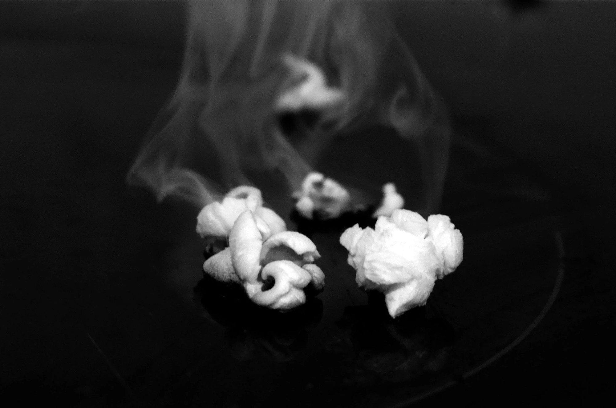
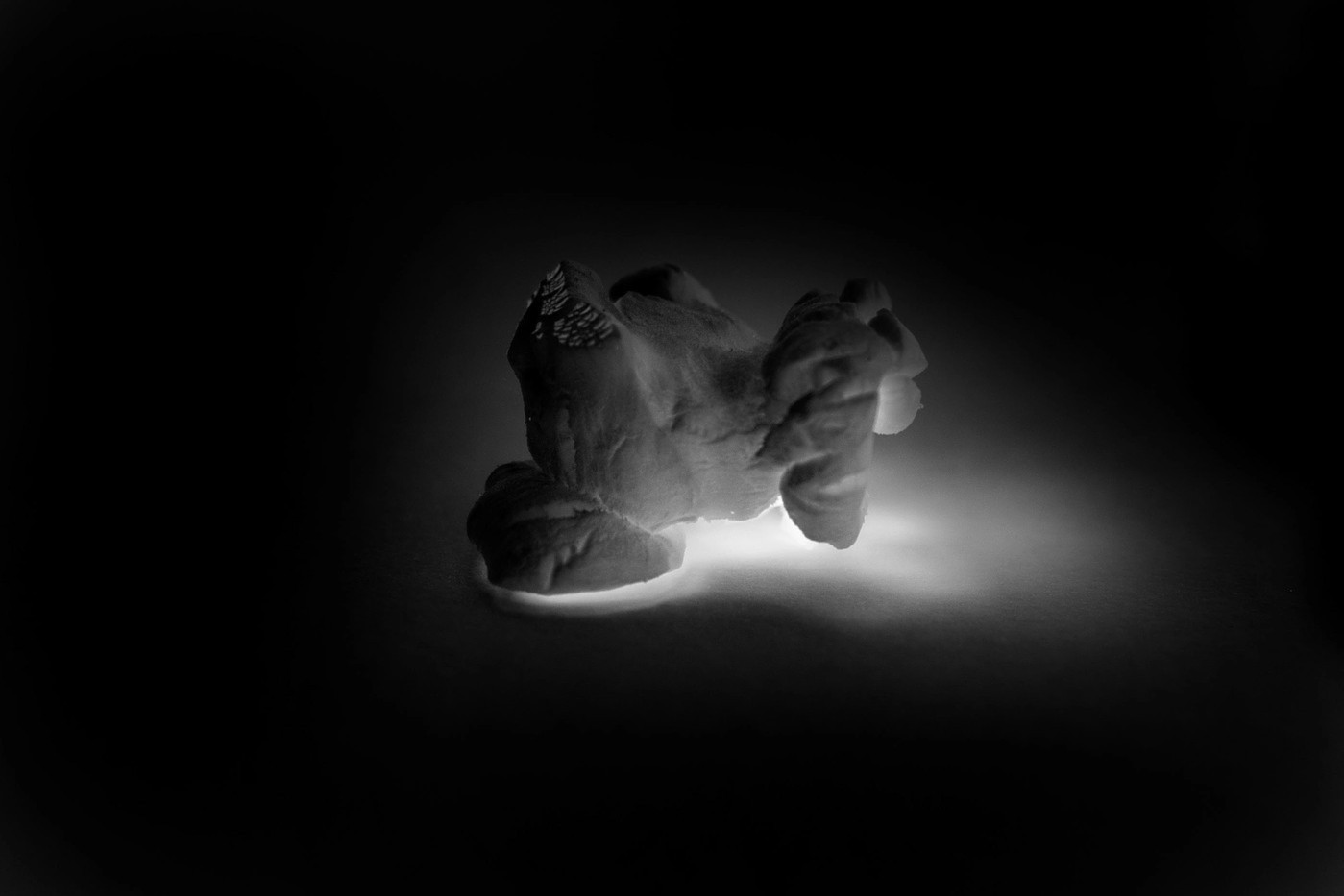
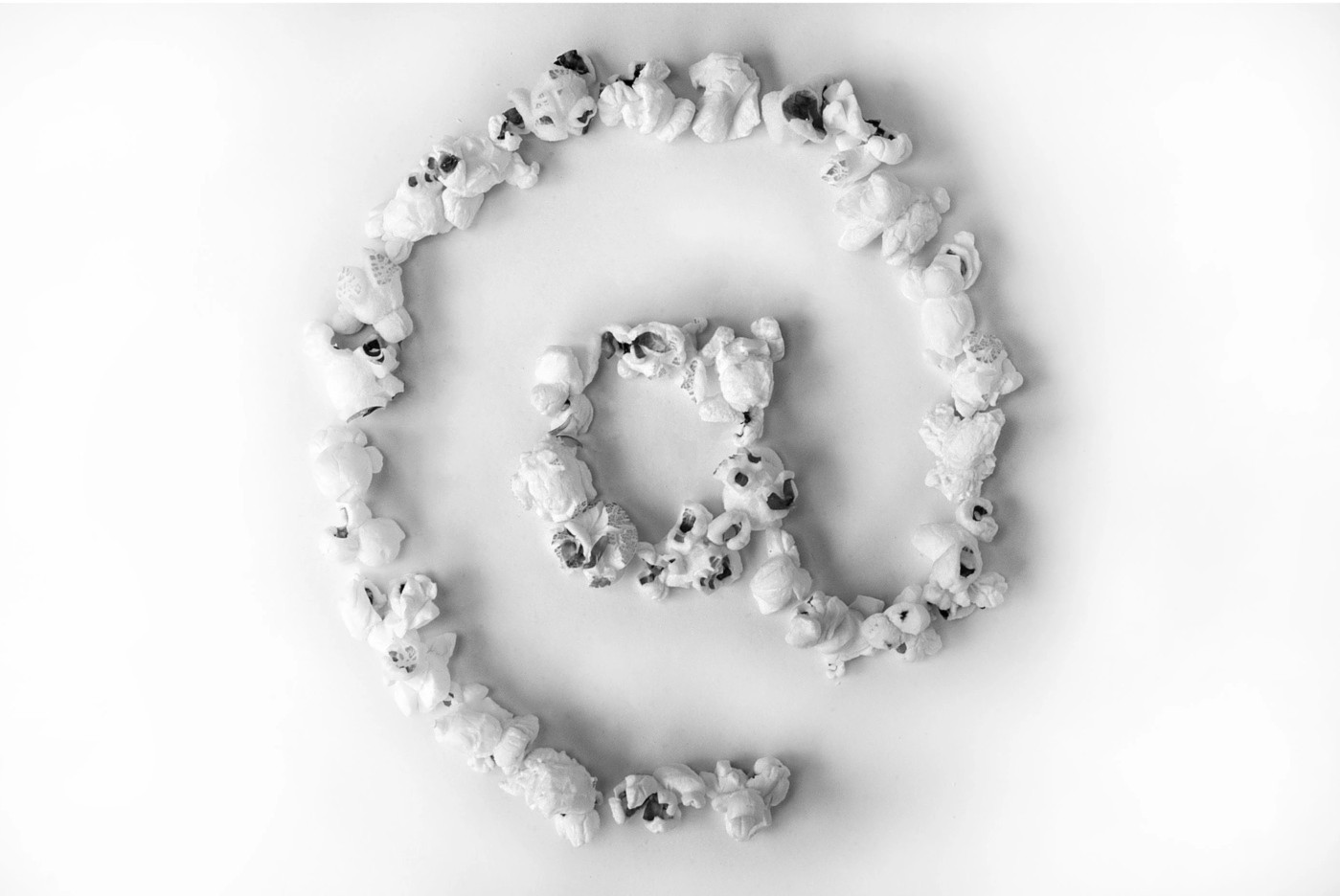
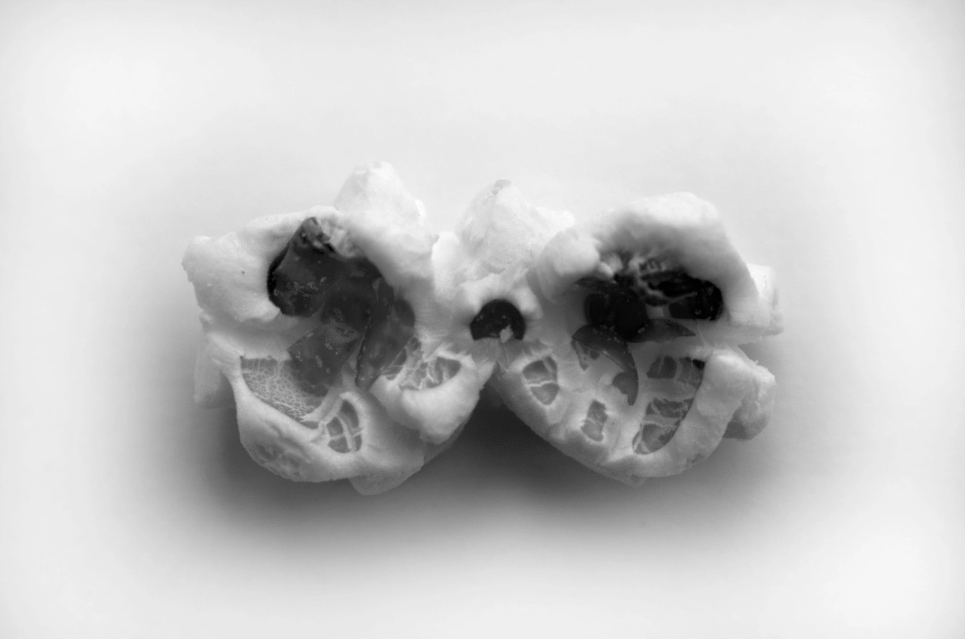
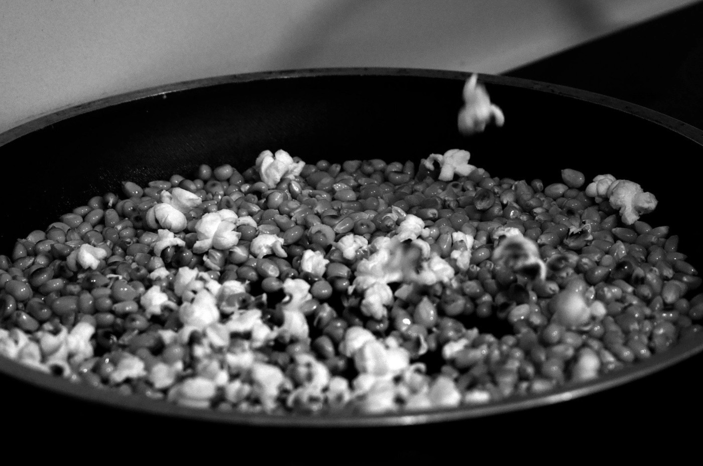
Objects contain universes we never see.
Crosby, Fletcher & Forbes proved this with A Book of Matches.
This project asks the same question differently: what if we stopped seeing a popcorn kernel as a kernel and started seeing the worlds within it? Through black-and-white photography, each image rewrites the story of this mundane object.
The work challenges how we observe the everyday, suggesting that design is really about changing perspective.
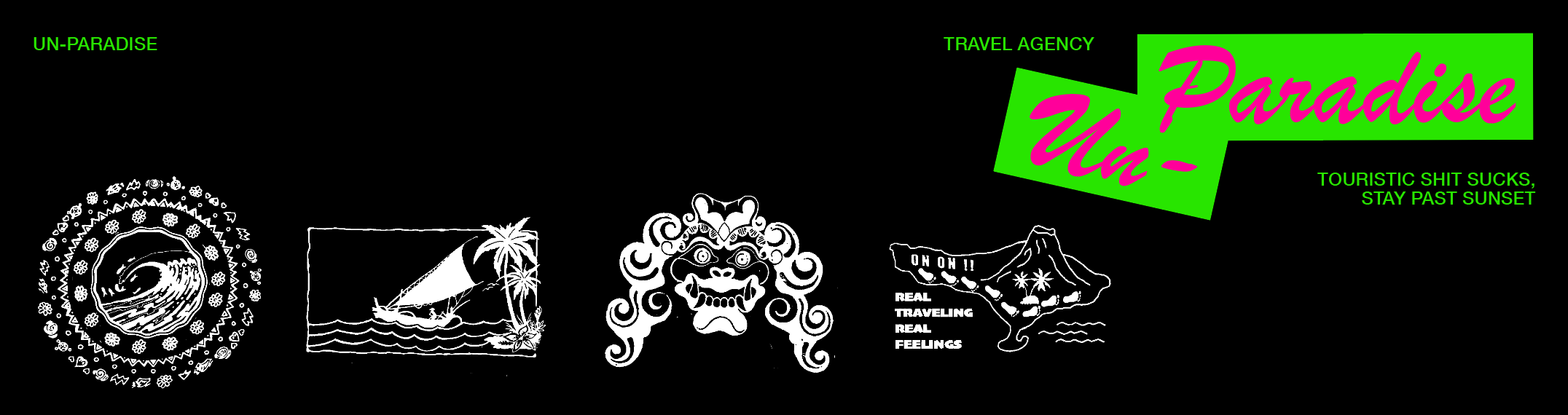
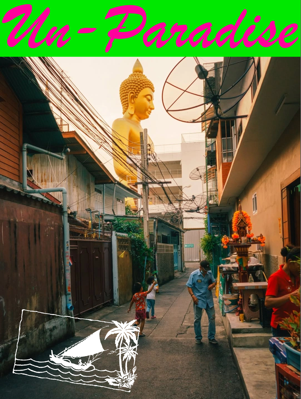
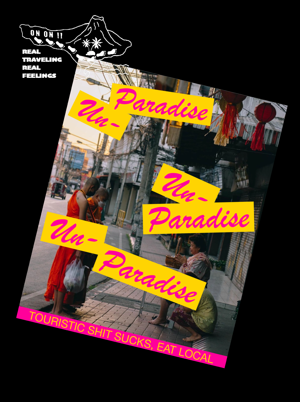
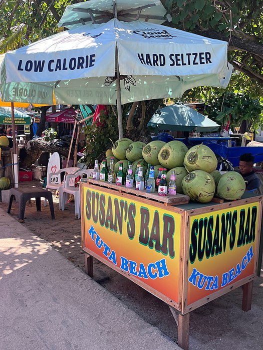
Western tourism has been selling the same “paradise” fantasy for decades.
Crystal waters, virgin lands, no culture. Just escape.
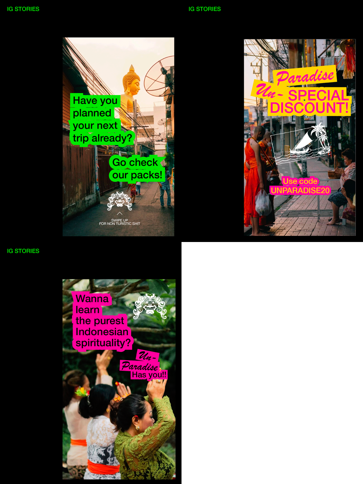
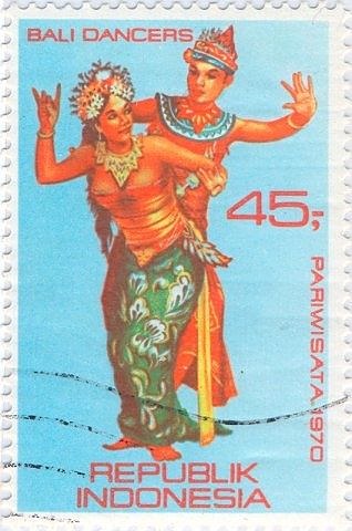
The travel agency's branding hijacks that visual language by appropriating 1960/70s (early tourism) Indonesian travel branding, recontextualizing vintage logos to flip the narrative on itself.
Saturated colors collide with documentary photography of actual local life, street markets, temples, people in context.
The copy cuts through: “TOURISTIC SHIT SUCKS”

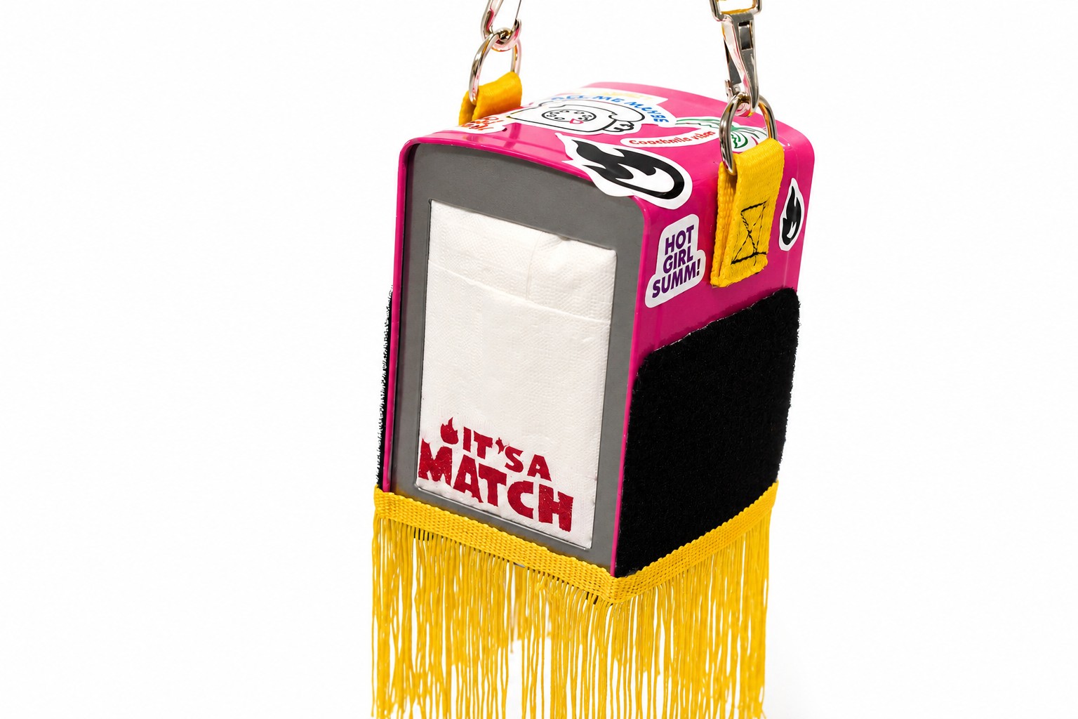
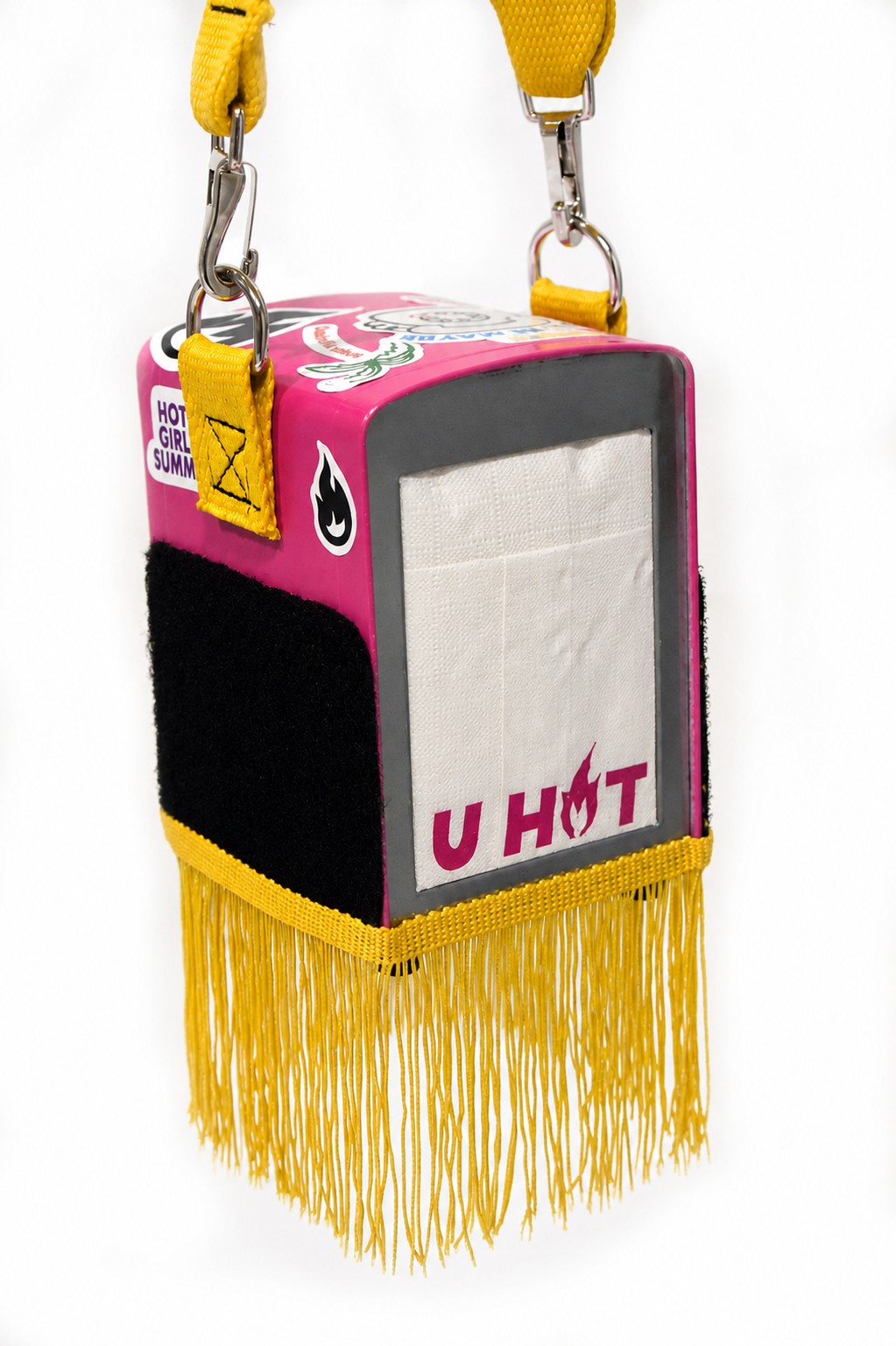
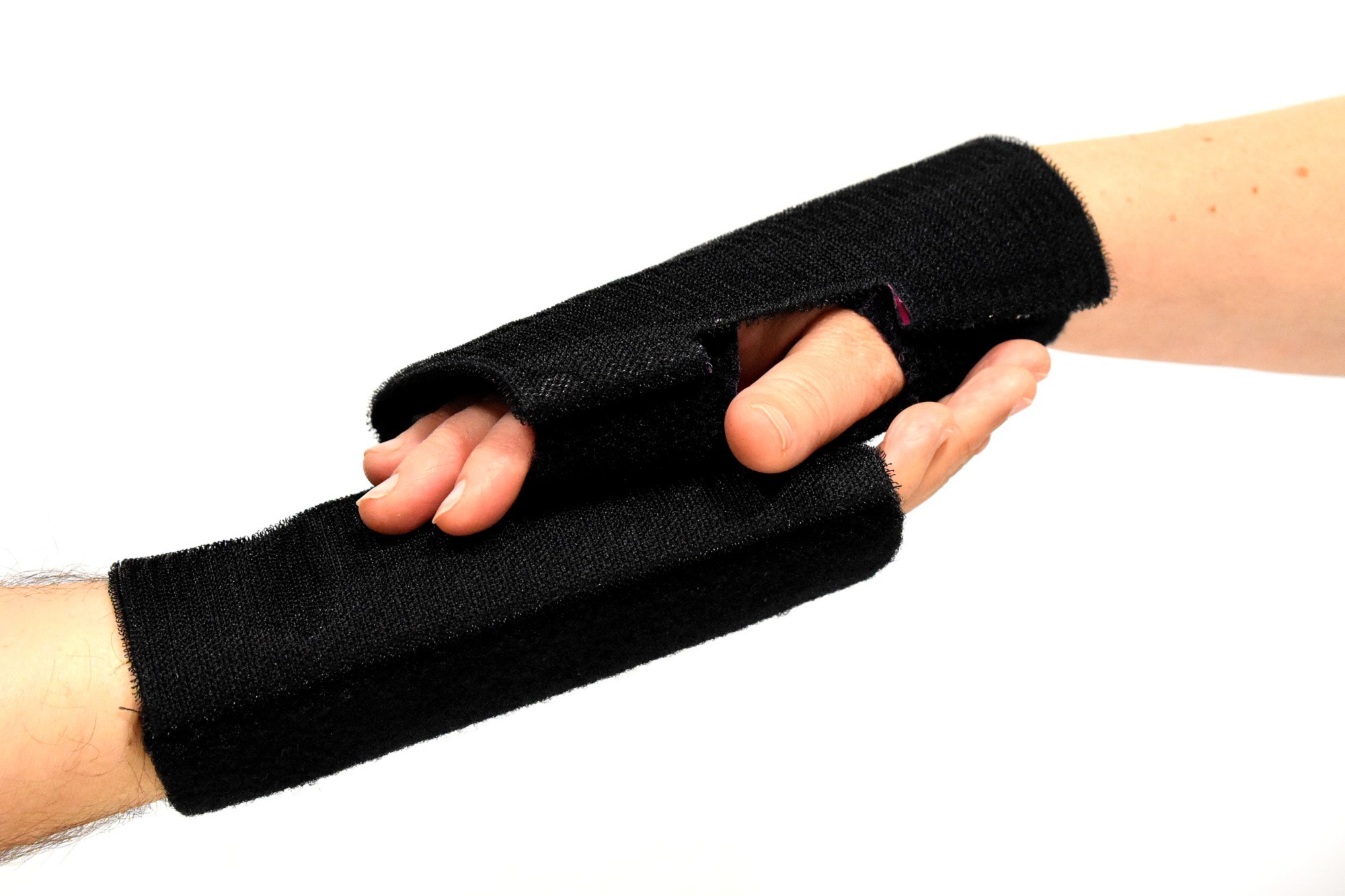
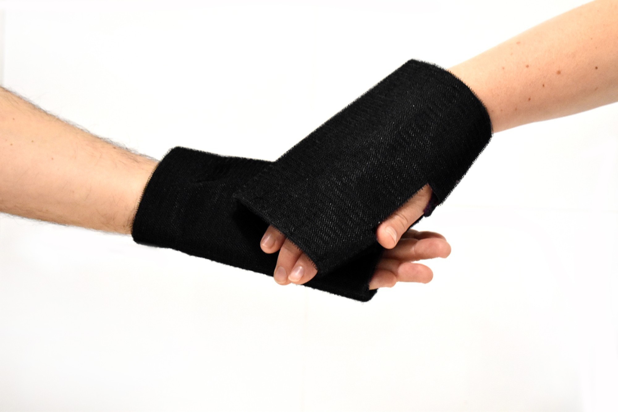
Why do we need objects that serve no practical purpose? Chindogu teaches us that the most honest design comes from embracing functional absurdity.
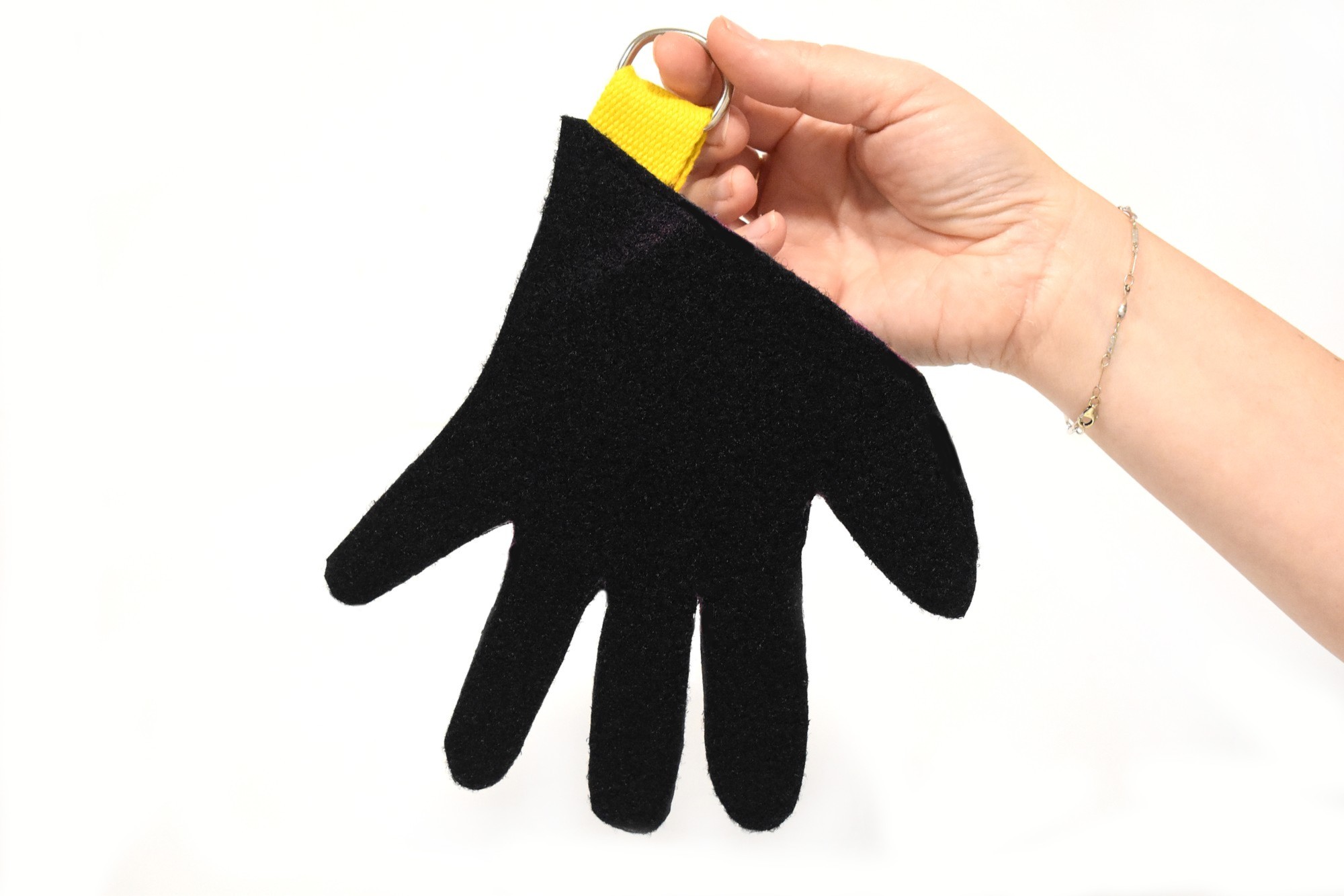
Hot Girl Festival Kit explores this: what if useless objects could become essential to how we belong and connect? The collection isn't about solving problems.
It's about celebrating the unhinged confidence of showing up differently at a festival.
A napkin-shaped clutch for flirting, Velcro gloves to keep your crew close.
Design as social ritual, not utility.
Placeholder de proyecto, sustituye este texto e imágenes cuando tengas el contenido final.
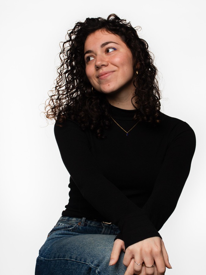
Nàdia Martínez
I work with brands globally who aren't afraid to exist loudly, exploring how design shapes identity through culture, humour, and intention.
Strategic vision and conceptual thinking are my starting point.
Endlessly curious about aesthetics, visual patterns, and the small discoveries that shift perspective.
I believe design is really about asking better questions.
and see forward the surface.
The roles I've taken on since, and everything I've had to figure out along the way, are what shaped the way I see design today.
Currently working remotely, wherever in the world I happen to be, always chasing the next weird idea, project, or team!
Graphic Designer | Art Direction, Campaigns and Conceptual Design
Direct brand strategy and visual identity for independent creative clients, from concept to final production-ready assets. Design end-to-end brand campaigns, including art direction, visual systems, and print-ready deliverables. Manage full creative process independently, client briefing, concept development, and final handoff, for design and branding projects.
Graphic Designer
Developed visual and typographic systems that strengthened client brand recognition. Delivered branding and identity proposals for high-profile clients, successfully approved and implemented. Designed social media assets that boosted engagement and aligned with brand strategy. Supported campaign rollouts under tight deadlines with high-quality deliverables.
Graphic Designer and Art Director
Managed brand strategy and digital presence for a personal brand with 130K+ followers, overseeing all creative and visual aspects. Designed content and developed graphic campaigns aligned with the brand's identity and growth objectives. Coordinated the influencer's agenda, including events, collaborations, and podcast invitations, ensuring consistency with brand positioning.
Graphic Designer
Led the creation of the company's full visual identity, transforming conceptual sketches into a cohesive brand system applied across platforms. Designed and delivered digital assets for website, social media, and marketing campaigns, boosting brand consistency and audience engagement. Collaborated with the marketing team to produce performance-driven visuals that supported paid campaigns and improved customer reach.
Bachelor's Degree in Graphic Design
Artistic Baccalaureate
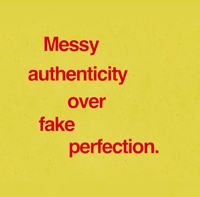
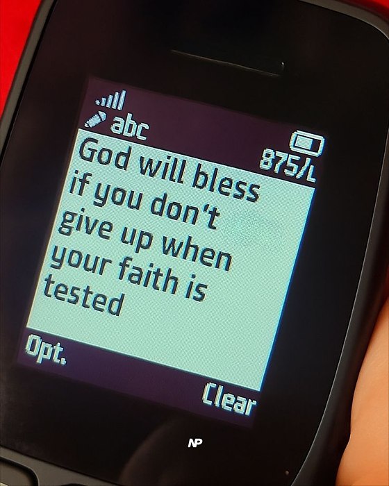
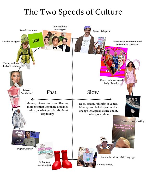
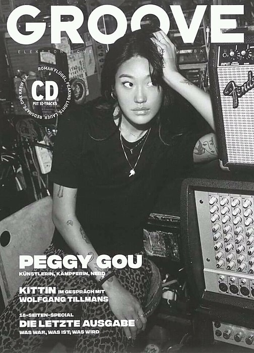
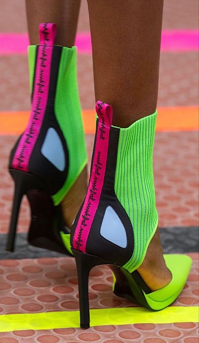
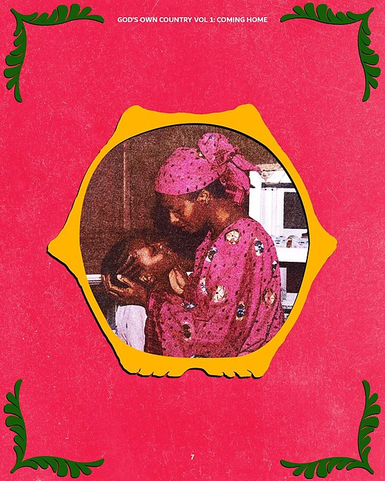
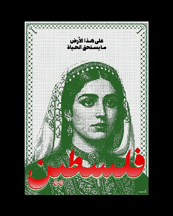
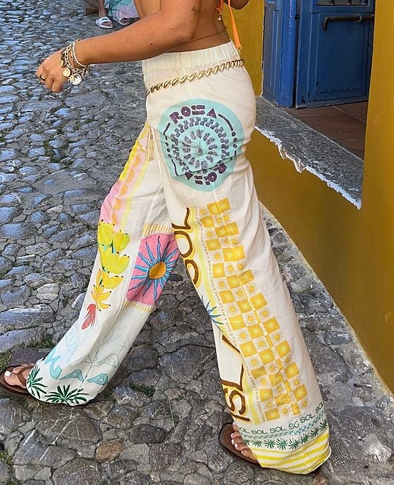
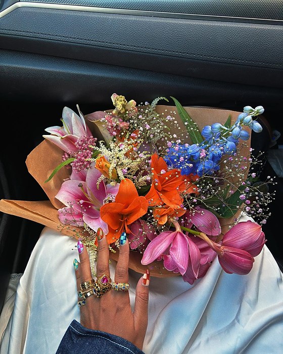
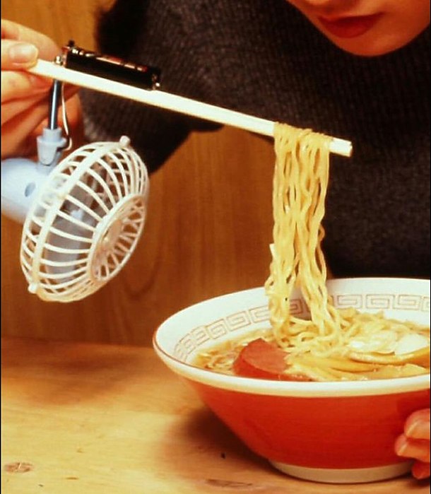
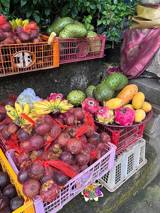
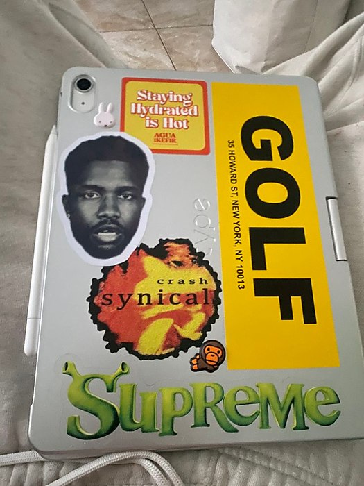
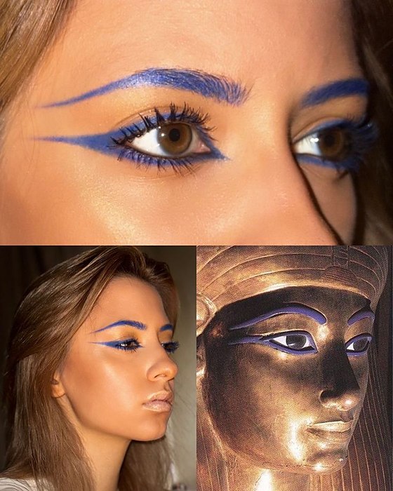
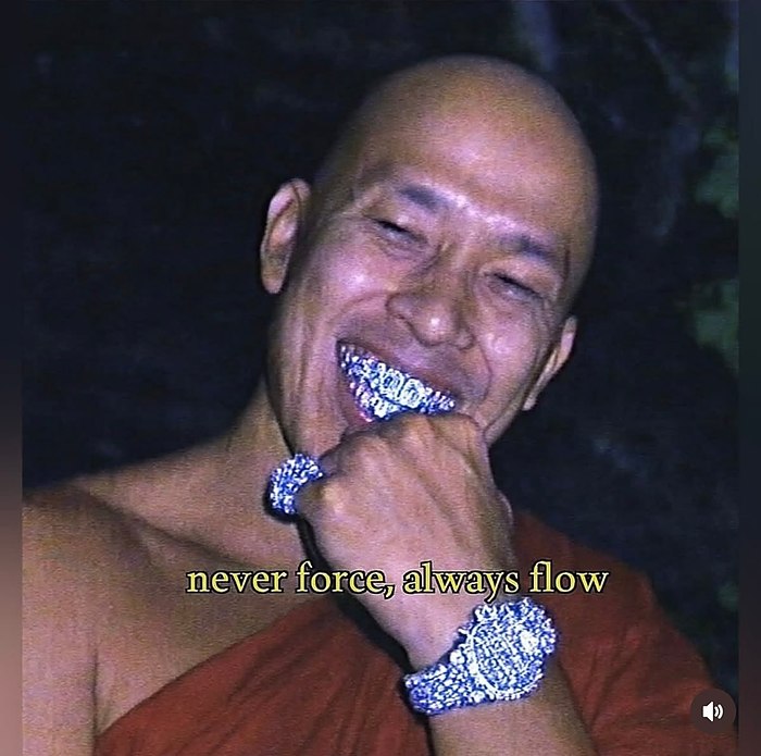
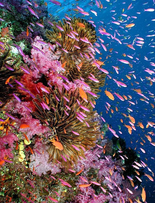
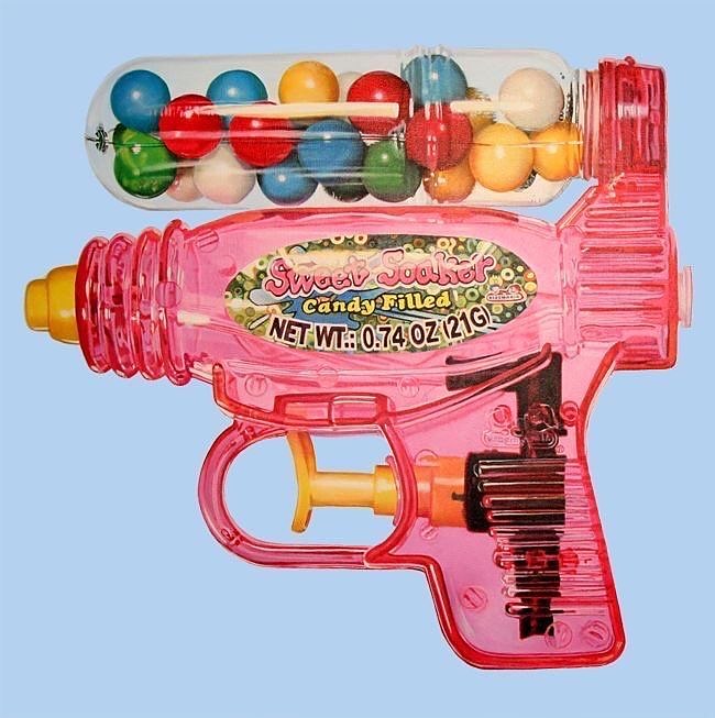
Inspiration finds me in different ways, this is a small space where you can step into my world.

Contact
Let's collaborate.
Whether it's branding, creative direction, or exploring new ideas together.